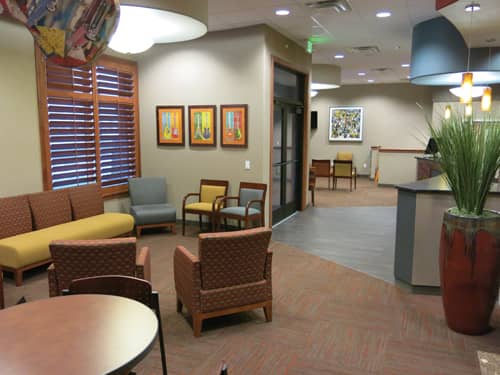
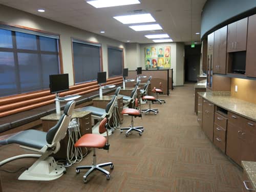
Color: It’s the design element that sets the tone and ties it all together. It relates personality traits and conveys messages. In essence, color has significant clout in the design process.
Brett Coleman, DMD, DDS, of Coleman Orthodontics, Syracuse, Utah, understands the importance of color. When he opened his practice in 2002, Coleman and his staff operated in a leased space of only 2,000 square feet. While the space looked and functioned fine, Coleman had his sights set on a more personalized office.
In 2007, Coleman purchased two acres of vacant land adjacent to his leased space with the intent of building a larger, more functional, more personal practice.

“I liked the process of building a custom office,” Coleman recalls. “It gave me the flexibility to be completely open-minded and incorporate all of our ideas into the plan.”
Early in the planning process for his new space, Coleman reached out to the design firm Matlack/Van Every Design, Santa Cruz, Calif.
“I wanted a space that just made people feel comfortable. Nothing over the top—just a place where families could relax, unwind, and take a break from a busy day,” he notes. “We had a sports theme in our previous office that worked well with the feeling we wanted to convey at the time. With our new office, we just wanted a neutral feeling that conveyed quality, top-notch customer service, and comfort.”
As Coleman explains, the design theme that he saw in his mind’s eye would appeal to his entire client base. “We treat primarily adolescents. However, we also see a decent number of younger kids and do some early treatment,” he explains. “I also enjoy the challenge and the reward of interdisciplinary treatment—about 25% of our practice consists of adult patients. It’s been great fun to see parents want smiles like their kids have, so we often end up treating Mom and Dad too.”
Keeping in mind the scope of his patient base, Coleman wanted a space that would be welcoming and appealing to all. To accomplish that task, he focused on color.
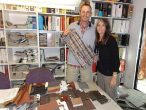
“My wife just happened to look down at the plaid shorts I was wearing that day—that’s when plaid was a little more in style—and they were the same colors we were talking about. So, we took those shorts into the design office the next day and said, ‘We want our office to look like these shorts!’ We still laugh about what became our color inspiration.”
Warm browns, deep reds, and pops of fresh and bright yellows, reds, and blues are frequent throughout the office space. Natural wood finishes and calming whites accent the space. In all, the colors work well together to convey the personality of Coleman and his staff, as well as appeal to the practice’s diverse clientele.
“I have a fairly reserved, calm, but inviting personality. I feel comfortable surrounded by the combination of these warm colors in the office,” Coleman adds. “The colors also create a feeling of professionalism and quality. My staff and I are dedicated to providing a quality and memorable experience for each one of our patients.”
An interesting design element in the space is a unique use of color that allows for the introduction of fine art that pops with color and has a fun, inviting undertone.
“I have developed a real appreciation for good art over the last several years—maybe because I’m getting older,” Coleman explains. “I’m drawn to art that makes you stop and stare and say, ‘Wow—that is really cool.’ The guitar was that kind of art. I found it in an art gallery in Park City, Utah, and it created that kind of emotion for me. We thought it would be neat to hang it so that all sides of the guitar were visible. We added another guitar piece in the same room just for coordination purposes.”
When Coleman started out with his new practice, he knew he wanted a specific endgame—a look and feel to his practice that was personalized and unique. And, as a result of the design of his current office, color was that path to perfection. “I am often asked the question, ‘If you could do anything different in your office, what would it be?’ I’ve thought about that question and I can honestly say that I wouldn’t change anything,” he adds. “I really like the overall flow of the office. It creates a feeling of organization and simplicity. I like how the colors complement each other to make it ‘feel good’ in the office.
“It’s been nearly 5 years since we completed the space, and I still find myself staying in different areas of the office and admiring how it all comes together. I often have the ‘Wow, that’s really cool’ moment.” OP
Lori Sichtermann is a freelance writer for Orthodontic Products. She can be reached at [email protected].

