It’s not every day that you come across an orthodontic practice that was designed to reflect a marketing brochure. However, in the instance of Mack Orthodontics, Burlington, NC, that was exactly the starting point for the interior design of the practice.
In early 2014, Kervin Mack, DMD, contacted Kate Bauer Design, St Louis, to create the interior of his new 2,700-square-foot office.
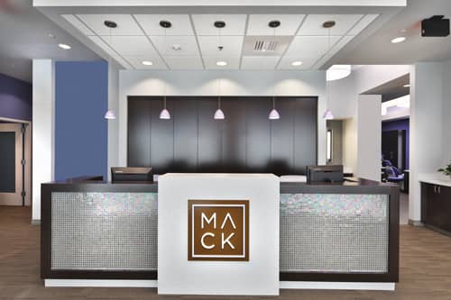
With a coffee-colored background and a sleek, white, minimalist font that spells out the word “MACK” and an ocean-blue highlight around the interior edge of the logo, Bauer was able to conceptualize the design of the office.
“Dr Mack let me be an artist in this project,” Bauer explains. “I was given the freedom to create a complete package that carried the theme and, ultimately, the brand.”
The design process of the office started in 2014 and lasted just over a year. The end result was a space that is fluid in terms of efficiency for staff and patients, while at the same time projecting the tone of the practice: modern, fresh, and professional.
“Our biggest goal with the design was to convey who we are as a practice,” Mack says. “We wanted it all to connect; from the website, to the marketing materials we send out, to even the logo on our shirts, we wanted it all to come together and act as one.”
Taking inspiration from the color palette of the brochure, Bauer created a color scheme of crisp blues, white highlights, and sleek dark brown wood that draws the eye, yet melds into the space.
From the minute patients enter through the front door, they are aware of a cohesive theme. The signature “MACK” logo is prominent at the reception area, flanked on each side by hundreds of shimmering prism tiles encased by the dark brown wood that extends onto the desktop.
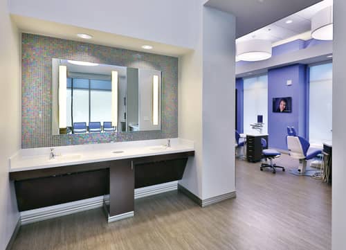
In the reception area, and throughout the office, is the crisp, ocean-blue color that is the singular highlight in the logo. It’s a color that is seen in every room of the office, but is used in a way that is charismatic, yet not overwhelming.

“The design of the office definitely has a sense of flow, in terms of design,” Mack says. “From one room to the next, it may have a different layout or use, but everything is cohesive.”
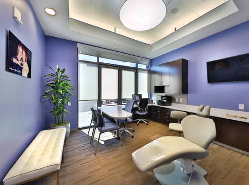
From the reception area, to the consultation room, to the treatment bay, even as far deep as the lab, the design, look, and feel of the office is intertwined. For example, in the private treatment room, which features a white pocket door, dark wood cabinets, and a pop of ocean-blue, there is also a panel of the reflective prism tile seen first in the reception area.
In the treatment bay, blue chairs and white accents contrast nicely with dark wood cabinetry and large white canvas-covered lights that hang from above. The combination of colors gives the room a feel that is welcoming, comforting, and chic.
“It’s easy to concentrate on the finishes, the fabrics, and the colors, but we wanted to take it one step farther,” Bauer notes. “Because the space had such a modern feel to it, we wanted to incorporate something that would really create a ‘wow’ factor for Dr Mack and for guests to the practice ?as well.”
For Bauer, the “wow” factor came in the form of flooring. As she explains, a specific type of carpet was used in the reception area, down the main hallways, and into the consultation room. “There’s a 3D sculptural element to the flooring that really makes it work with all the crisp, straight lines going on throughout the other areas of the practice,” she says. “It just gives it all a bit more texture.”
While nearly all orthodontic practices have a cohesive color palette that flows throughout the office, few have used those colors as brand recognition. For Mack Orthodontics, the colors that flow seamlessly through nearly every inch of the practice signify who they are as a practice.
“When patients look at our website, see our ads, or walk into our office, they can instantly see how all these elements tie together,” Mack says. “Incorporating the design of our office into the branding of the whole practice helps to resonate who we are and what we do. We have a large presence in our community because we have an understandable brand.” OP
Lori Sichtermann is a freelance writer for Orthodontic Products. She can be reached at [email protected].