When Claire Ferrari, DDS, MSD, opened her practice in November 2015, she had a specific list of design elements she wanted fitted throughout her new space. For instance, vaulted ceilings and ample amounts of natural light throughout were a must.
With a footprint of only 1,150 square feet on the ground level—and a 350-square-feet office space on a second level—Ferrari also wanted the space to have an open, airy feel. “I wanted it to look and feel more like a yoga studio than an orthodontic office,” she explains.
On any normal piece of paper, these design elements may seem relatively easy to achieve. However, on this particular blueprint, the execution of the project proved to be a bit more complicated.
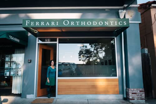
Ferrari Orthodontics is located in Kensington, Calif—a quaint, hillside village that overlooks San Francisco Bay. The office is nestled among a row of shops in the village. As Ferrari explains, hers is a long, narrow space with businesses on either side, which doesn’t allow for natural light, except from the street-facing windows at the front of the building.
“When I first came across the space, it felt much narrower and closed in,” she explains. “And, after it was gutted, it reminded me of a bowling alley.”
 In addition to the challenges of creating a bright, airy feel to the cramped, closed-in space, the building also needed seismic work. According to Ferrari, two large-scale moment beams had to be inserted into the already tight space—one in the front of the office and one in the middle. What’s more, several steel beams had to be installed along the exposed brick wall.
These alterations to the blueprint not only delayed the design timeline, they also added a few more hurdles toward the end goal of creating a bright, airy space.
“It was important to me that the design and feel reflect something deeper about how I work, what I enjoy, and how I treat my patients,” Ferrari explains. “I wanted to use natural, sustainable, and nontoxic materials as much as possible. I also wanted an office that was healthy and inviting for my patients, while at the same time being a space that my staff and I would enjoy working in. Ultimately, I wanted the design to reflect the quality of care we deliver. I bring a lot of care and creativity to my work.”
To relay her intended message, Ferrari worked closely with designers at Design For Health, Santa Cruz, Calif, to transform all of the complications of the space into a functional and aesthetically pleasing office.
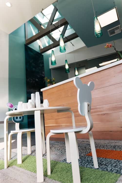
Architects broke through the ceiling to install skylights along the narrow space, which helped provide natural light and the vaulted look that Ferrari initially desired. The obtrusive steel beams were painted to match the warm, natural color palette that was used in other areas of the office. River stones and glass were added to the poured concrete floors so, when finished and polished, every step revealed an element of nature. Concrete was also used on countertops, which, as Ferrari explains, provided a richness of texture. “They feel like leather!”
The design team also created wooden accent elements throughout the space using reclaimed fir taken from an old, deconstructed home in San Francisco.
Benches were installed along the interior brick wall to reflect and complement the steel “fins” that crossed over the ceiling—necessitated by the seismic work. “I love their simplicity,” Ferrari adds. “They are beautiful, they integrate into the space, and they’re highly functional.”
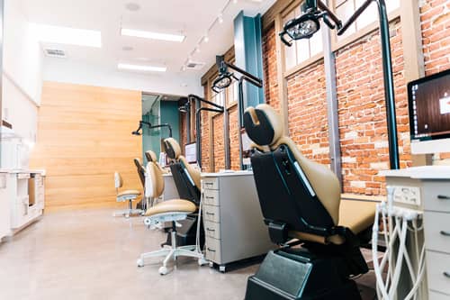
 Functionality was an issue from the initial planning stages. With a narrow, yet long, footprint, flow and efficiency were top-of-mind.
“The design team and I played with one layout that grouped the chairs ‘two-and-two’ with heads facing each other and delivery units in between, but it was clear that having a row of four would work better with the long narrow space,” Ferrari recalls. “I was concerned that it would be too tight to function well with the chairs opposite the sterilization area, but it has turned out to work really well. I was also concerned about people having to walk to the back of the office to reach the consult room or the bathroom, but that never became a problem. The space flows perfectly.”
With a relatively simple wish list for a relatively complicated space, Ferrari and the team of designers were able to produce an office that is nothing short of a piece of art. Natural elements are present throughout—brick, wood, bamboo, glass, river stones—and meld almost seamlessly with the heavy industrial features that were mandated at the beginning of the project. Tying it all together is the abundance of natural light from above.
“While I guess the space could be classified as modern and sleek,” Ferrari says, “I think of it more as beautiful and functional.” OP
Lori Sichtermann is a freelance writer for Orthodontic Products. She can be reached at [email protected].