By Alex Bagden
A website is at the center of any orthodontic practice’s online presence, and a well-designed site can result in more new patient phone calls, higher conversion rates, and better visibility in the community. But given all the options for building a new website, there are some key characteristics that must be considered.
When designing a new website for an orthodontic practice, we focus on three key features. First, we design the site to be “responsive” or to respond to the device that is viewing the site. Second, we create original content—both written and visual—so that the website is unique. Finally, we select images that are vibrant and catch the visitor’s attention. These three elements combine together to create a modern website that will pique a visitor’s interest and perform well in searches.
A responsive website is one that displays differently (“responds”) on different devices so that it is always optimized for the device viewing the site. This means that the navigation, images, and layout of the content change based on whether the viewer is using a phone, tablet, or desktop. For example, a mobile site will have images optimized for the smaller screen of a smartphone or tablet, and will have the written content oriented vertically so a user can scroll through the site easily.
On the other hand, a desktop site will have higher-resolution, wider images for the larger screen of a desktop, and a navigation menu optimized for clicking with a mouse, not scrolling with a finger.
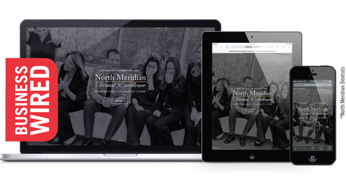
The site shown in Figure 1 was designed to be responsive; it displays the same content differently for different devices. You can see that all show the first image a visitor sees when arriving on the website, but using three different viewing platforms. The left image is the desktop version of the site. For the desktop, the website loads a high-resolution version of the photo that adjusts its width for different desktop screen sizes; notice how much wider this image is compared to the other two images.
The image on the right is from an iPhone. A lower-resolution version of the photo is loaded so that it can be downloaded faster with the slower connection speeds of a phone. This image is also much narrower to accommodate the narrow screen of smartphones in portrait mode. Finally, the image in the center shows an iPad loading the same site. Notice how the image is cropped differently for the iPad compared to that of the iPhone or desktop.
By making a site responsive, the orthodontist only needs to maintain one version of the website since that version will load in any device. This makes maintaining the site much easier, since there is only one copy of the platform. In addition, with a responsive site, all content is available in a similar viewing experience to all visitors to the website. This creates a more uniform experience for all viewers and more consistent messaging since everyone sees the same information. Finally, the doctor can have confidence that the site is loading well on all devices, since the website is designed to react to the different screens.
Considering Content
We’ve all heard the web adage that “content is king.” This is particularly true for the modern website that competes against the constant content creation of social media and blogging. To set yourself apart from all the other websites competing in your area, it is important to have content that is unique to your practice. We have found that the careful selection of a few powerful words and images can make a strong impression on a visitor.
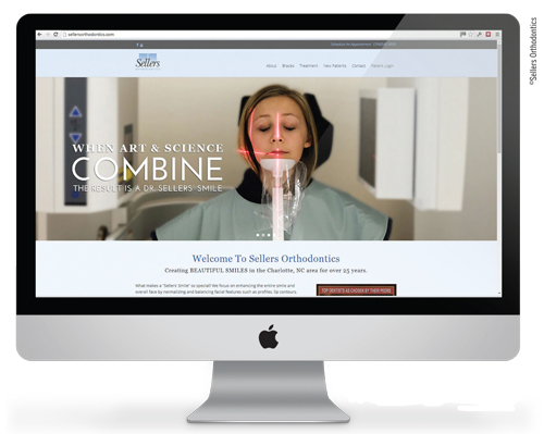
In Figure 2, the doctor’s tag line “When art and science combine, the result is a Dr Sellers’ smile” is unique and memorable. This is complemented by a powerful image of a patient receiving CBCT to demonstrate the use of technology.
The result is a lasting impression for visitors to the website that is memorable. This first impression is carried with the patient through the entire on-boarding process as the patient learns how “art and science combine” to make their perfect smile.
Original content on websites not only makes the website unique, but it performs better on search engines like Google. The more original written content on a site, the more information for Google and other search engines to index and the better your website will perform. In fact, duplicate content on a website can be penalized by search engines, which lowers the site’s ranking.
As download speeds on the Internet have increased, websites are able to use increasingly larger files without affecting the performance of the website. This has given developers the ability to include larger photos on websites, resulting in the trend of large, powerful photos appearing on the landing page of the website. As a result, the best websites take advantage of this trend by using original visual content to make a great first impression on visitors with powerful, unique images that are immediately visible.
The easiest way to get powerful, original visual content is to have a professional photographer come to your office to take pictures. This typically only takes 2 to 3 hours and can be performed at a reasonable cost, but the results will make a dramatic improvement in the quality of your website. With professional photos, you can show patients your personality, your office, your staff, and even your patients through the photos on your website. By adding disclaimers like “current patient” or “actual patient,” you can increase the credibility of your website by letting potential patients see your results.
Frequently, the raw images provided by the photographer need to be cropped and edited. This is where a talented web developer can make a big difference.
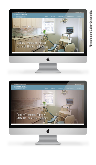
Compare the two images in Figure 3. The first image is the original image from the photographer, and the second is the same photo with an overlay created in Photoshop. For this orthodontist, the goal was to create a classic, timeless look for the website to match the personality of the office. The overlay darkens the overall image and changes the color palette to match the website. The result is that a previously unremarkable operatory is now a vibrant image.
The combination of these three elements can make a powerful and effective website. By focusing on a responsive design, websites will present well on any device that visits the site. And by combining vibrant images and unique content, such a website separates itself from the competition by being original and memorable. The result is that you can create a website that makes a strong impression on visitors and converts more visitors to new patients. OP
Alex Bagden is CEO of Rooster Grin, a digital marketing firm for dental professionals.


